
The colours of your brand and logo can have a massive psychological impact on the way your clients feel and how they react to your website and content.
Even subconsciously, colours provoke emotions and it is these emotions that drive our decision making. This means when used correctly not only will it strengthen the brand association, but it could also affect your total sales. Take a look below to see how these may be influencing your potential customers.
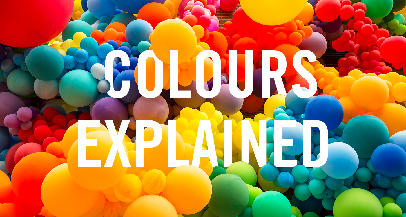
Explore the connotations associated with 9 favoured colours:
1. Black
One of the strongest colours that can be used. Although it can be perceived as unfriendly and cold, it also signifies power and control.
Sophistication, luxury and power – Black represents formality and holds a refined quality that is often associated with the affluent.
Death, evil and illness – Too much black can bring about negative emotions such as sadness and fear, particularly when used for that purpose.
2. White
Directly opposite to black both in terms of colour spectrum and connotation, it represents purity and minimalism.
Innocence, wholeness and integrity – For such a simple colour, white has a lot of meaning. From religion and spirituality to cleanliness and wealth.
Simple, formality and transparency – Due to the clean nature of white, for some, it is found to be stark and clinical and therefore lacking warmth.
3. Orange
Holds a sense of enthusiasm and cheer but can be overbearing and superficial.
Fun, Youthful and creative – Orange is a friendly colour that can be used to create trust and invigorate people.
Superficial, cheap and unprofessional – Be careful, too much orange can diminish an aesthetic.
4. Pink
Most commonly associated with love and innocence, although it can be relayed as overly emotional.
Feminine, sentimental and romantic – Pink is often associated with romance and trust. It is used to create a calm atmosphere and build relationships.
Immature and foolish – Using pink can be perceived as childish and lacking in quality.
5. Green
Symbolises growth and nature. Because of this, it is often associated with being ecologically beneficial and responsible.
Balance, calm and harmony – Green represents luck and nature, giving projects the vibrancy associated with life.
Jealousy, rotting and dirt – Green is connected with decay which may become an issue when trying to present luxury.
6. Yellow
Joyous and radiant. Most people think of yellow as the happiest of colours!
Energy, passion and happiness – Yellow has the ability to brighten any image. It has the connotations of sunshine and warmth which is why it is perceived as joyful.
Danger, fear and toxic – Yellow can create feelings of anxiety and unease, largely due to the colouring of venomous animals such as wasps and snakes.
7. Blue
A dependable colour, it is serene and calm,. It boosts confidence and makes people feel peaceful and imaginative.
Trustworthy, calming and regal – Blue holds more meanings than any other colour around the world. It represents trust, security and authority, which is why it is used in healthcare environments.
Depressive, melancholic and inflexible – Blue is often associated with sadness and ‘feeling blue’. Because of its authoritative history, it can have an oppressive undertone.
8. Red
Has the longest wavelengths which make it one of the most powerful colours. It can have many positive and negative connotations such as love, power and anger.
Passion, power and beauty – Red is commonly used to emulate wealth and beauty. It is the most common way of expressing love and romance.
Aggression, danger and violence – Red also has the negative connotations of pain and anger.
9. Purple
A deeply spiritual colour, associated with intuition and meditation. It is also used to present richness and quality.
Authenticity, status and contentment – Because of its association with the upper class, purple has been applied to products of decadence in the food and drinks industry.
Inferiority, exclusion and expense – Purple is the colour of lavishness and, because of this, can leave people feeling excluded.