Following on from our previous blog ‘Web Jargon Simplified‘ this week we wanted to talk about design considerations when approaching a web project.
Our Creative Director and Head of Digital Matt Peace has been designing and building websites since the year 2000 – it is fair to say he knows a thing or two about creating the perfect online experience for the end-user! This blog lists some of the primary elements of a website along with some helpful advice and tips from our expert.
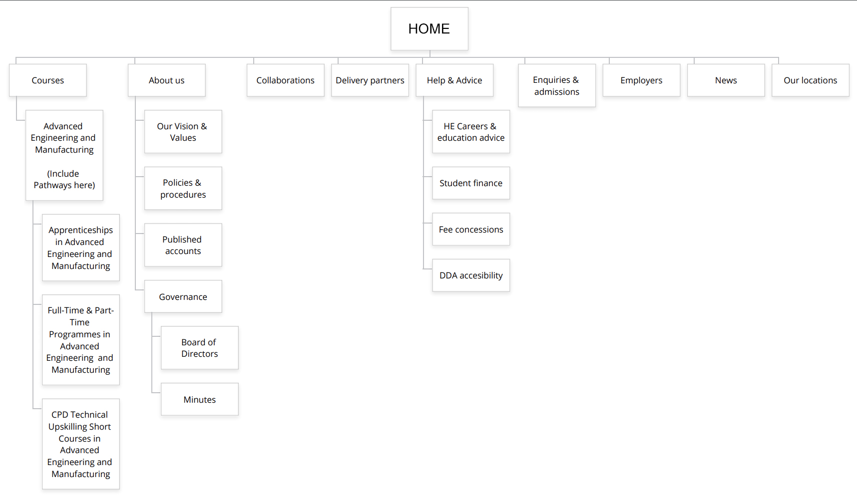
Sitemaps
There are a few different definitions of a Sitemap. First up is a Visual Sitemap; these are useful when planning website structures. They would mainly include all the pages and navigation points that would be on the new site. These sitemaps often look like flow charts with the home page at the top working its way down like a family tree, showing all the pages and their connections within the website.
Secondly, most sites have a Sitemap Page. These are useful navigation tools for savvy users to find specific sections or pages on a website if they are unable to find them via the main navigation.
And finally, there are XML sitemaps. These are files that you generally wouldn’t see by browsing, however, they are submitted to search engines such as Google to aid them in ‘indexing’ the content you want them to find, and helping those all-important search results to improve your SEO.
Our expert says: “Kicking off a web project by focusing on the navigation and site structure might seem a bit dull, but it is actually vital to enabling a clear visual design process.”
Wireframes
Wireframes are a rough, fast way of prototyping a web page layout with the basics before any visual design details are added. These scamps also allow you to quickly plan the hierarchy of page content areas and how the multiple elements will sit with each other in a harmonious and user-friendly way. They are sometimes digitally designed or hand-drawn, either way, they are imperative to helping a web designer visualise the necessary ‘ingredients’ of a page. Assets such as buttons, primary images, call–to-actions and copy all need to fit together like a jigsaw and wireframes allow designers to do this quickly.
Our expert says: “I like to think of wireframes like an ingredients list and the recipe for a page. They help you see what the priority of the content will be and are essential in the planning stage.”
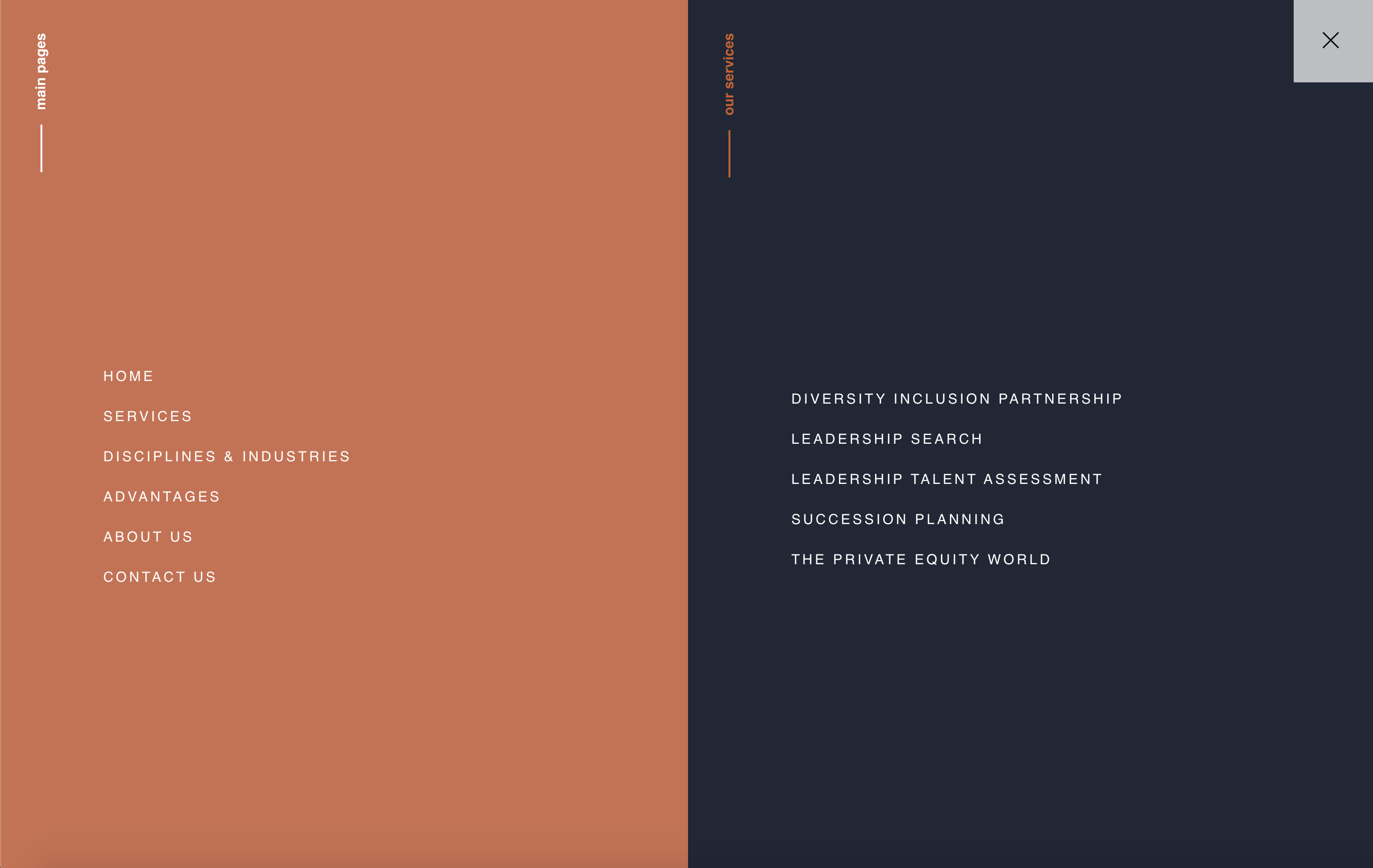
Main Navigation
The main navigation section of a website helps users get from A to B (and sometimes Z depending on your sitemap).
The most familiar menu found is a drop-down which displays web pages so users of the site can access information easily and quickly.
There is also the space-saving navigation method known as the ‘hamburger menu’ which is growing in popularity in mobile-first web design. Designing menus that work across multiple devices and screen sizes is about understanding how your users are viewing and interacting with the website. You need to find a balance between space saving and showing the user what they are looking for. Navigations need to be intuitive and user friendly; otherwise, you will lose your audience before they have even begun.
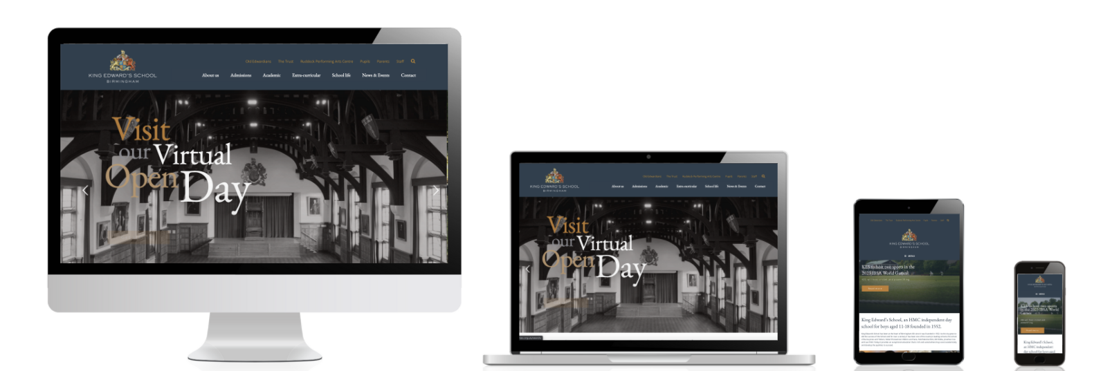
When designing and building the Harper:Fox Global website, we knew we needed to create something that would distinguish them from their competitors and portray a modern and refreshed look to recruitment. The responsive design makes navigating through the site clear and straightforward.
Negative space aka white space
When designing websites, it is crucial to include negative space. This is areas of space within layouts between images, text, and other assets. Although often referred to as white space this is not referencing to colour, it is simply the unused areas in designs. The use of negative space is just as important as the content. Overcrowd your assets and/or copy, and it will feel cluttered, busy and hard to navigate. Spread your elements too far, and the page will feel empty, boring and disconnected. By using the right balance, negative space will direct the user’s eye through a page, and the information will be easily absorbed as well have a visually appealing and user-friendly interface.
Our work for Shireland Technology Primary School uses negative space effectively. The area around the images accentuates the bold and creative nature of the designs, creating a professional and engaging site for the school.
Our expert says: “Looking for examples of negative space? Look no further than Apple! They changed the face of design with their user-friendly, design-focused minimalistic approach and mastery of negative space.”

Photography
Images are just as crucial in websites as content. High-quality photographs should always be used to ensure a positive user experience.
For example, when creating an e-commerce site, you must use high quality, large images to ensure that the customer knows exactly what they are buying. Imagine visiting a site and seeing images that are pixelated or too dark or too small… Would you buy that product? This rule applies to all websites, not just e-commerce! If users see bad imagery, they will not trust in the website or brand.
Our expert says: “A picture says a thousand words. A photo can evoke an emotional response and attachment to a product, service or brand. Make sure the photos you use are reflective, responsible, honest and high quality!”
Call to actions
A call to action in basic terms is what you want a user to do when they come on to your website. Examples of typical call to actions are signing up for newsletters, visit another web page or purchasing a product via an online shop.
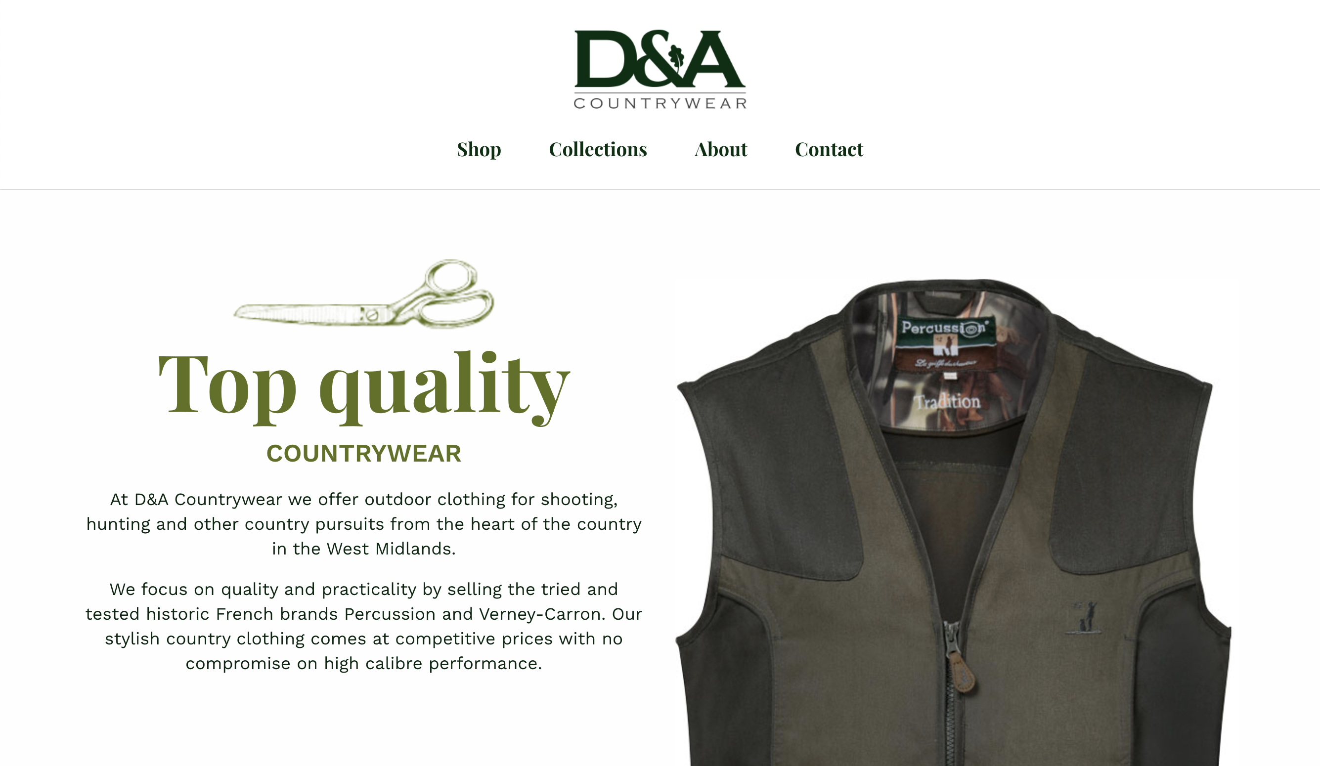
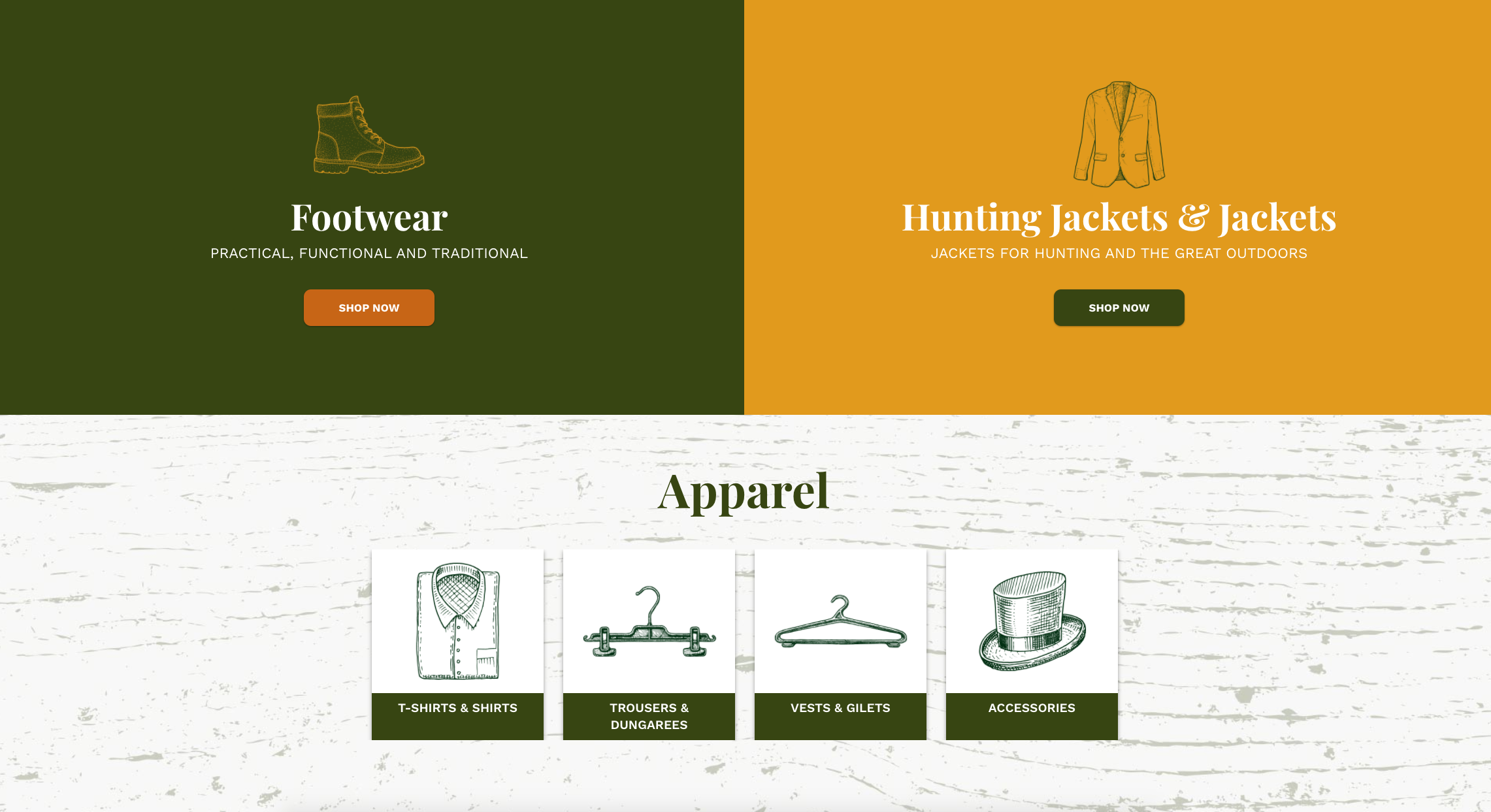
You can find some great examples of CTA (call to actions) on the E-commerce site we built and designed for D&A Country Wear .
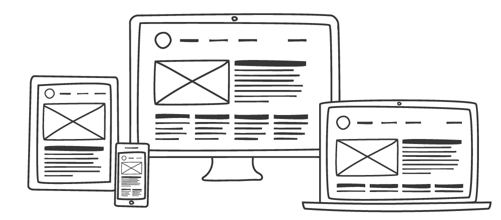
Responsive design
Responsive web design is when a website adapts its layout depending on what device it’s being viewed on. This is important as consumers now have an Omni-Channel user journey. Put simply, people visit websites via different devices and at different stages in their journey. For example, a person is more likely to be browsing multiple sites several times using a mobile device when searching for a product or service. When the user has then found what they are looking for, they are then likely to access the site via a desktop to make their final purchase or commit to a service.
Websites need to be responsive as the users will view the site on desktop, tablet and mobile. The percentage of users viewing a site on desktop, tablet, or mobile will depend on what the site is and who the audience is. For example, our website has over 80% of its visits from desktop users. This does not reflect national figures where internet visits are now predominantly accessed via mobiles or tablets.
When approaching your website design, you must have the end-user in mind, how will they be using your site and for what purpose. Do your research before starting!
UI – User interface
It is easiest to think of UI as the smaller assets and elements such as menus, buttons, hover states and things that have an interaction with the user. Animations that scroll in as a page is traversed can also be considered as UI. Traditionally UI comes from software design, so things like Microsoft Word have more of a User Interface with text tools, icons and so on to help you use that tool more ergonomically.
UX – User Experience
Arguably more important than UI is the UX. This covers broader considerations than interface elements, it’s about how someone uses the website.
Everyone is different and uses sites differently with individual habits and preferences depending on the type of site. For example, a user will instinctively use a shopping site differently to how they would use a school website. Goals and needs are not only different but so are expectations and user knowledge.
Good UX design will consider different levels of ability, accessibility, expectations and so on to design a site that delivers a user-friendly experience while standing out from the crowd and breaking down often restrictive boundaries within website design.

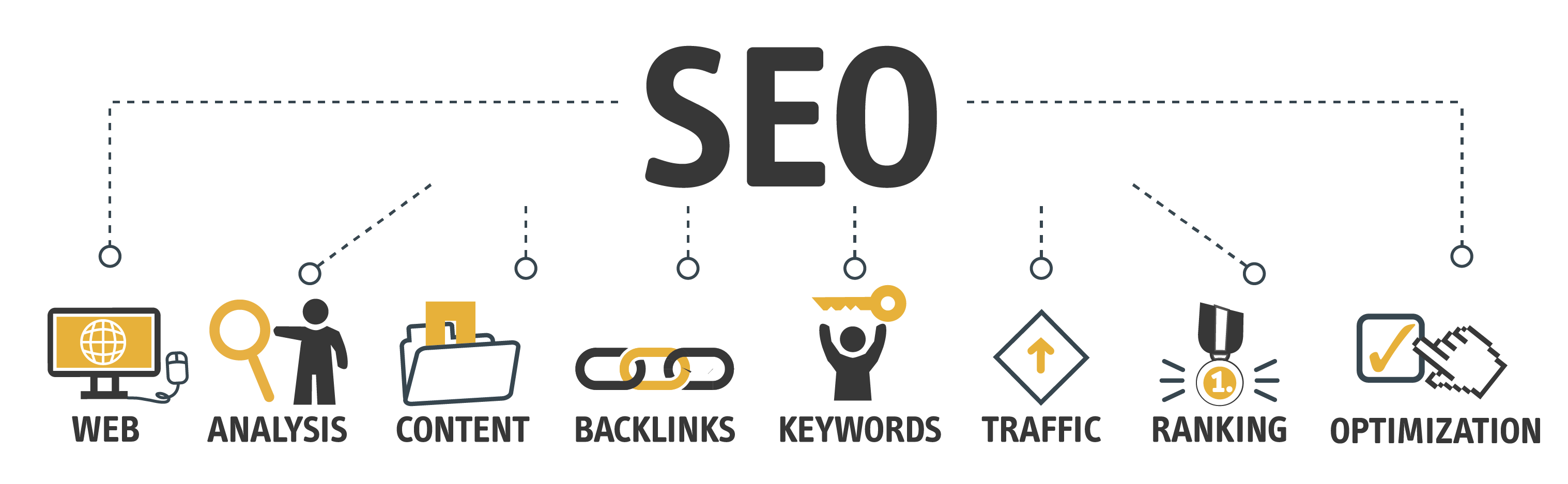
SEO
SEO stands for Search Engine optimisation. To organically increase traffic to your website optimising your SEO is critical to appearing higher in search rankings, for example, through Google. The rule of thumb is if you don’t appear on the first page you won’t be found! Your SEO can arguably be one of the most important considerations when building a site. There is no point having an all singing and dancing award-winning site if no one visits it. There are many ways to improve SEO, so if you would like to find out more information, get in touch with us, and we will be happy to help you.